A Modern Designer’s Canvas | Smashing Magazine:
“A Modern Designer’s Canvas By Andrew Clarke March 25th, 2014 Community, Creativity, Inspiration
When I gave this talk a title, I called it ‘A Modern Designer’s Canvas,’ because originally I was going to talk about the tools and processes that I use when I’m designing. But being a good designer or developer is about so much more than knowing how to use tools. It’s also about the way we approach what we do and our attitude towards it. I’m going to talk about four lessons that can help us do what we do better. These have been important to me, especially over the last challenging few years, when how we make websites has changed so much. They’re lessons that I learned a long time ago, at art school: Find a medium that expresses your interests and talents. Don’t get intoxicated by a process or fall in love with tools. Challenge what you’re told, including what you’ve heard at conferences and in articles. Beat your own path, rather than walk someone else’s. It’s been 30 years, give or take a week or two, since I applied to art school. That was in 1984. It’s funny, thinking back. In ’84, we thought that the British government spying on its own citizens using technology was just going to be dystopian fiction. What I learned at art school has stayed with me over the 20-something years since I graduated. They were the lessons that helped me get started in this business, which wasn’t even on the horizon in 1984. They’re lessons that helped me adapt so that I could stay in business when the business of making websites changed so dramatically. They’re lessons that enabled me to take risks with my business, risks such as adopting Web standards and responsive design before many of the people around me at the time did. Art school taught me a lot, but, honestly, going there was a very humbling experience. I came from a small-town school where I’d always been in the top tier for art. I was one of only two people that year who went on to study art, but when I got to university, I felt like everyone around me was much better than me.
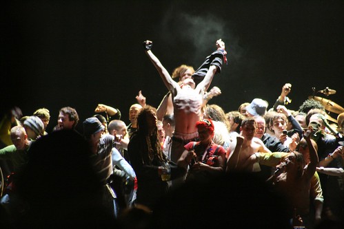
Andrew Clarke speaking at the Smashing Conference, Oxford. (Image credit: Marc Thiele) I imagine that’s how many people feel when coming to a conference. We’re the ‘experts’ where we work, but at a conference, everyone seems to know more than we do. I feel like that, and I also feel it when I read an article about some new language or about a technique or tool and I think I should learn about it. I doubt I’m the only person who feels this way. Finding A Medium That Best Expresses Our Interests And Talents Technology is supposed to make our lives less stressful, but it’s hard to think of another industry where what someone does changes so regularly. I’ll admit that I’m more confused than ever about what I need to learn. It’s hard not to feel stressed by the thought that we have to learn or aspire to be an expert in, well, pretty much everything. Sometimes that stress can turn into mild panic when we feel that everyone else knows something we don’t. When I started designing websites, I used Frontpage, and then Dreamweaver. One of the biggest changes I made to what I do was at the start of the Web standards movement, when I learned to write HTML and CSS. Many designers did the same, but some people think that’s not enough anymore. Jeff Croft wrote in January: ‘What we may not have realized is that once the browsers don’t suck, being an HTML and CSS ‘guru’ isn’t really a very marketable skillset.’ Hardly reassuring. ‘Diversify or die,’ he says, before pointing out that front-end developers are just as likely to be grilled in a job interview on Backbone.js or AngularJS or Node.js as they are on HTML and CSS. But does every front-end developer need to learn Backbone or Angular or Node? What about designers like me? I learned to write HTML and CSS because I needed them to express the designs that I made. Code became my medium when designing became more than about making an artist’s impression of a website. HTML and CSS were the first ‘code’ I’d ever worked with. Some of my more technically inclined friends came to use those same languages after they learned programming. Although we both know HTML and CSS, their working knowledge is very different than mine. They know programming languages. They understand JavaScript. They’re comfortable with the command line. They’re the technically minded people who understand Backbone or Angular or Node. Me, I couldn’t write a script if my life depended on it. That’s because my mind works in a different way and I have different working knowledge. This comes from my art and design background, so I might not know Backbone, but I’m a devil with a Bezier curve. Assuming that someone has the same knowledge as you — because they share common languages like HTML and CSS — can leave them baffled. I see these assumptions being made in articles and tutorials time and time again. I know I don’t have a mind for development, so I never feel under any pressure to learn new development tools or technologies unless they’re directly relevant to the work I’m doing. There’s a very strong likelihood that if you’re a designer, you probably won’t ever need to know how to write a Grunt runner. Designers might have felt pressure to learn about tools and technologies that have traditionally been the province of those of us who are more technically minded. At the same time, we might still feel pressure to learn about subjects whose roots are in other academic areas — subjects such as information architecture, content strategy, research and maybe even analysis of data. But do we need to be experts in these areas to be good designers? It’s easy to feel disheartened when you think that simply ‘designing’ isn’t enough, or that making something beautiful is somehow a superficial endeavour. If you feel like that sometimes, I’m with you, but we should always remember that making something beautiful takes knowledge and experience. Understanding proportions and ratios for layout, knowing color principles and ‘seeing’ typography, really seeing it, aren’t things you can learn overnight. Far from being superficial, ‘making a website pretty’ is a skill that we should be very proud of. It’s also one that’s going to be in demand long after the latest fashionable development framework has been forgotten. I’m not saying we shouldn’t learn new things or that we should stay in our comfort zone. What matters is finding the right medium to express our ideas and talents. We’ll likely not need to learn everything, but we will need to learn to be great at the things we do. Jeffrey Zeldman wrote recently: ‘[…] now may be the time to up your game as a graphic designer, or experience designer, or front end developer. ‘Diversify or die’ may be overstating things a bit. But ‘follow the path you love’ will always be good advice.’ If you ‘follow the path you love,’ then you’ll find your medium, although it might not be what you expected it to be. When I went to art school, I thought I was a good painter. That’s because in high school, painting was as much about precision and predictability as it was about creativity. High-school art classes were about learning techniques so that we could reproduce a painting of something that we’d likely painted several times before under exam conditions. Many people speak today about designing with data, so that we can produce designs that are predictable. A lot of people crave predictability, which sometimes makes them rely on data, rather than their own intuition. Personally, though, I want to see designs that are more inspirational than predictable. The current trend for ‘flat’ design makes me feel very nostalgic. I painted flat because I loved the hard-edged graphic quality of pop art. I also loved David Hockney’s work, especially his ‘splash’ paintings, but I’d only ever seen them reproduced in books, where they were obviously much smaller. The printing process also flattened them, removing the subtlety and depth, something I didn’t realize until I saw the paintings in galleries. I discovered upon reaching art school that I was actually a pretty poorer painter than my new peers. Unlike them, everything I painted ended up looking flat, no matter what my subject matter was. It wasn’t just the content I’d chosen — my technique and the way I painted said as much about me as about what I was painting. We hear a lot today about the benefits of iterating a design; it’s an approach that I recommend to our clients. But, for me, painting wasn’t an iterative process. I couldn’t let a painting develop over time, making my way across the canvas, gradually adding layers of paint. I couldn’t trust in the low fidelity that we see in our gray-box wireframes today. I had neither the faith nor the patience to iterate. I needed to work in high fidelity right from the start. Today, the equivalent would be skipping sketching and diving right into Photoshop to create a high-fidelity design. Instead, I worked on one part of a painting until it looked finished. Then, I’d move on to the next part. It was like painting by numbers. I kept my eyes so close to the canvas that I couldn’t see what my painting looked like from a distance. I missed seeing the whole because I was focused on the parts. As a result, my paintings appeared not only flat, but disjointed. I’m seeing this in today’s website designs, too. It took me months of dissatisfaction to realize that painting is as much about temperament as about technique. I realized that I wasn’t suited to painting and that it wasn’t the right medium for me to communicate my ideas. I was fortunate because the degree I was studying was ‘unstructured,’ so after the first few weeks of introduction and becoming acclimatized to our new surroundings, we were left as unsupervised as we wanted to be. There was no timetable, no lectures, no set work — except for a dissertation that I wrote about Batman — no organized trips to the botanical garden to draw exotic plants. We arrived and our tutors said, ‘Hello.’ Three years later, they came back and said, ‘So, what did you do?’ The lack of structure allowed students to move between disciplines — painting, sculpture, printmaking, photography — whenever we wanted to. This lack of supervision didn’t suit some people. If someone wasn’t highly motivated or didn’t know their path or their medium, then they usually floundered. Some people couldn’t cope at all and so switched to a course that offered more direction. Others left altogether. A few moved into the life-drawing class and never left. They spent three years drawing flabby flesh because they craved the predictability, the reliability that life in the life room gave them. They became incredibly technically proficient — as you might expect — but proficiency doesn’t guarantee good art, nor great design. Not Getting Drunk On Our Processes Or Falling In Love With Our Tools In high school, we’re taught that there’s only one right answer to any question. Our entire education system — some might say our entire political system — hangs on the premise that an answer is either right or wrong. Something either is or isn’t. Something either happened or didn’t. Something’s either possible or isn’t. We need everything to be right, so we try to find the one right way to do it. It’s one of the reasons why we come to conferences. We want to know the right, best way to work with responsive images. We want to know whether Flexbox is what we should be using. We want to discover the best process for designing or developing a website in this modern, responsive era. We want to create systems that make the outcome of design predictable. But: What if there is no right way to work with responsive images? What if Flexbox is useful, sometimes? What if there is no best process for responsive design? What if systems hinder the creative process? Samantha Warren wrote about style tiles on A List Apart back in 2012: ‘Style tiles are the cornerstone of a solid design system that sets client expectations and communicates the visual theme to all the project team members. Designing a system rather than site pages gives your team the tools to create a living, breathing website.’ I’ve been writing about how to avoid setting the wrong expectations for a few years. In particular, I’ve written about how the processes, tools and artefacts that we’ve inappropriately brought with us from historical media to the Web can hinder communication and reinforce the wrong expectations. Since the earliest days of the Web, designers have been using graphics tools — such as Photoshop, then Fireworks and lately Sketch — to create full-page visuals that are intended to demonstrate how a website will look when it reaches a browser. Designers will often create visuals of dozens of templates or pages. These comps (or PSDs or flat static visuals or high-fidelity design artefacts) not only are used for experimentation and creative expression, but actually become the currency of Web design. Designers exchange them with clients for approval and then for money. Clients and designers exchange them with developers to be used as blueprints for the content, design and functionality of a website, then, finally, as QA tools. But despite their popularity and longevity, they’re terribly ill-suited to all of those roles.
The tools and processes we’ve relied on for years are no longer capable of properly designing today’s flexible, responsive Web. Using these static visuals is ‘bringing a knife to a gun fight.’ They can only communicate something that’s superficial, artificial. They’re high-fructose, extra sweet, but even though of little nutritional value, people love them and so want more and more. We designers have largely learned to live with all of the deficiencies of static visuals, and we compensate for them with our familiarity with the tools that we use to make them. Worse than any deficiency is the frequent absence of communication when we hand a visual to someone and ask them to judge it. Instead of using visuals as aids to communication, we let the visuals speak for us. This happens especially when we email them or upload them to Basecamp, along with some vague request for ‘thoughts.’ When we hide behind design artefacts in this way, we leave a tremendous amount open to misinterpretation and, because of that, are far more likely to set the wrong expectations. Type rendering will look different on a real device. Fonts won’t be exactly that size on all devices. The layout will be different at various viewport widths. So, what are our goals when showing a static visual to someone, usually a client? Once we’re past the feedback stages, we’re likely looking for sign-off on a design. We need that approval either to conclude our business or to confirm that a design is ready to move to another phase. Of course, we’re not really asking them to judge the visual at all, are we? In reality, we’re asking them to look beyond the visual and to judge what they extrapolate will be the look of the finished Web page. In effect, what we’re saying is, ‘Here is a better than artist’s impression.’ For their judgement to be at all meaningful, we therefore need to make the visual to be of the highest fidelity. Ideally, we’d like it to look identical to a screenshot of the finished page. When we’re asking for sign-off, we’re implying that the finished Web page will ultimately be a facsimile of this visual, a carbon copy, a clone. And if that’s not what we’re saying, then what’s the point of asking someone to approve it at all? Have you ever wondered — responsive websites aside — why so many Web pages are fixed width and centered in the viewport? Do you think it has anything to do with the fact that clients sign off on fixed-width visuals. I’d say one’s a direct result of the other. I’d go further and suggest that asking for approval on visuals should be considered harmful, because we’re reinforcing that outdated notion that a Web page should be a facsimile of a frozen image. We’ve been suffering from the effects of this notion for years, because when we ask for sign-off on a frozen image, we immediately leave ourselves open to the problems that often come when we later have to implement that design. Think back to the number of times you were forced to explain to a client why Internet Explorer doesn’t render your border-radii, box-shadows, CSS columns or gradients. Think about how many hours you then wasted employing polyfills to prop up an aging browser, just so that it could live up to the promise you made when you sold the visual to the client. To save ourselves from this agony over the years, we’ve designed to the lowest common denominator in our matrix of browser support. We’ve eschewed so many useful CSS properties until the dominance of those legacy browsers faded. My book Hardboiled Web Design was all about how to challenge that unambitious thinking. One of the things I admire about Samantha Warren’s approach is that she emphasizes communication. Samantha says that style tiles ‘provide a catalyst for discussions,’ and I really appreciate that because what often matters most isn’t the way we design but the ways we communicate it. I spoke earlier about finding the right medium, and it became very clear to me that high-fidelity visuals, those that represent the future look of complete pages, are rarely the right medium to communicate Web design. When a visual encapsulates everything about a design, instead of helping us to find clarity, it provokes multiple conversations about different topics, all at the same time. We might need to talk about typography. Instead, the client’s eye wanders across the page because they’re distracted by the size of the logo. Other times, we might want to talk about color as part of an interaction vocabulary, but they can’t help noticing an out-of-date product photo. People too easily get distracted and conversations become unfocused when we show the totality of a design too soon. I’ve been searching for a better medium to communicate my designs, and I’ve found that separating a design into several components is incredibly helpful. I’ve also found since doing so that my conversations about the design have been more focused and productive. How often have you heard someone say, ‘I don’t like the design.’ Did you dig deeper and find that it wasn’t the details of the design they objected to, or that it wasn’t the typefaces or the way you used color. No? It might have been, ‘The sidebar should go on the left, not the right.’ People often mean to comment on the layout of a design but express their criticism of the design as a whole. They conflate layout with the look and feel and call it ‘design.’ Designers do it, too, because we’re used to making and demonstrating visuals that include all of these things. But now it’s time to discuss non-layout and layout elements of design separately. This means that the look and feel of individual components and how they are arranged on a grid are now two separate design challenges and that, whereas layout will undoubtably change across screen sizes, the look and feel of a component will almost certainly stay the same.
The devices and screens we design for today are a variety of sizes. (Image credit: Foundation) Take away layout and what’s left is what I describe as the ‘atmosphere’ of a design. Atmosphere refers to the feelings that are evoked by color, texture and typography. You might already think of atmosphere in different terms. You might call it ‘feel,’ ‘mood’ or even ‘visual identity.’ However you describe it, the atmosphere of a design doesn’t depend on layout. It’s independent of arrangement and visual placement. It will be seen, or felt, at every screen size and on every device. The idea of working on components out of context has been gathering pace over the last few years. If it sounds strange, in fact we’ve been abstracting design this way for a long time — for example, when we create mood boards or share cropped Dribbble shots. In his article ‘Content Choreography,’ Trent Walton writes: ‘Web designers will have to look beyond the layout in front of them to envision how its elements will reflow & lockup at various widths while maintaining form & hierarchy.’ I like this approach, because separating components from layout can help everyone to focus on the design, while setting no expectations of how the components will be arranged responsively across viewport sizes. I said earlier that we love to identify patterns and create systems because we crave predictability. That’s why we’re always searching for the ‘right’ process. But while separating components from the layout and designing them independently has improved communication, I know that this approach doesn’t work for everyone and is certainly not right for every project. That’s why I’m wary of defining it as a ‘process.’ I’m wary because I’ve learned how important it is not to let our processes define what we make. When I read about design process, I’m worried that we’re simply replacing one set of design artefacts with another — in this case, Photoshop visuals for pattern libraries — and that we’re becoming so intoxicated by our processes and falling so deeply in love with our new tools that we’ll again lose sight of what we’re actually making. Challenging What We’re Told Back in 2009, I gave a talk titled ‘Walls Come Tumbling Down,’ in which I discussed how important it is to make more time, time to be creative. I suggested then that we should reduce repetition — make fewer high-fidelity visuals — and design systems instead of pages. I should be clear that I was talking about designing a system, not design as a system. Design-system thinking has taken hold, and it can take several forms, from style guides as a design deliverable to full-blown pattern libraries as design tools, not documentation. There are now some widely cited pattern libraries, including one by Starbucks and one for A List Apart. One system that’s become synonymous with responsive Web design is Brad Frost’s ‘atomic design.’ Brad wrote about atomic design just last summer: ‘Lately I’ve been more interested in what our interfaces are comprised of and how we can construct design systems in a more methodical way.’ He goes on to describe how his system comprises atoms, molecules, organisms, templates and pages, the result of which should be: ‘a clear methodology for crafting design systems.[…] Because of this, we can create systems that promote consistency and scalability. And by assembling rather than deconstructing, we’re crafting a system right out of the gate instead of cherry picking patterns after the fact.’ Brad’s inspiration for atomic design was chemistry’s periodic table. I can’t imagine anything less creatively stimulating. Not everyone’s convinced about abstracting design the atomic design way, though. Mark Boulton wrote of his concerns last year: ‘Conformity and efficiency have a price. And that price is design. That price is a feeling of humanity. Of something that’s been created from scratch. What I described is not a design process. It’s manufacturing. It’s a cupcake machine churning out identical cakes with different icing. But they all taste the same.’ It’s important to remember that creativity should never be — by definition, can never be — as predictable as a manufacturing process. We cannot and should not attempt to rationalize creativity by moulding it into a process. Fletcher Knebel, an American writer born in 1911, said this: ‘It is now proved beyond doubt that that smoking is one of the leading causes of statistics.’ Instead of finding more time for research and data gathering, I’d like to use any extra time we have to come up with new, better ideas, because no amount of research is a substitute for a good idea. At least not on its own. Peter Seibel, one of the designers at Etsy, said this in 2012: ‘Science is powerful and it’d be silly to abandon it entirely just because there are ways it can go wrong. And it’d be equally silly to think that science can somehow replace strong, talented product designers. The goal should be to combine the two.’ Perhaps the most important lessons I learned at art school were not to take what we hear or see at face value and to question everything we’re told. Everyone should do that. I want you to always ask, ‘Can I do it better?’ Remember that just because something’s been done doesn’t mean you can’t do it better. There’s really nothing we can’t improve, and we don’t have to improve it for everyone — improving it for ourselves is often more important. We’re very fortunate in our industry to have the ability and the tools to improve something that someone’s made — be it a small piece of code or a full framework, a tip or a complete workflow. Blogs, RSS and, more recently, Twitter enable us to hear of a new method minutes after it’s been written up. Tools like CodePen and GitHub allow us to fork code and make it our own. I published my open-source Contract Killer on GitHub, and the best part of doing that wasn’t giving people a chance to use what I made, but giving them an opportunity to add their own insights to make it better. In fact, nothing I’ve shared hasn’t been improved simply from being shared. But sharing is just a catalyst; developing an idea takes time and patience. I mentioned earlier that at art school I couldn’t let a painting develop over time. I needed to start in high fidelity. My friend Ben, on the other hand, and other painters around me knew how to let a painting develop. Ben started the course by making six giant 6 × 6-foot stretchers. He then spent all three years working on those six paintings. I saw Ben more often in the pub than in the studio. He’d come to the studio once a week, sometimes twice. Each time he’d add a subtle layer to each painting. Some weeks, he’d wrap a rag in white spirit and take paint off those canvases. I find that fascinating, that we can make something better by taking part of it away, by reducing, simplifying, rather than adding to it. It took a long time for Ben’s paintings to develop, not just in fidelity but also in the purity of his ideas. I wonder now whether he had a clear idea of how they’d develop or what they’d develop into when he started? I hope he didn’t. I hope that he allowed his ideas to develop as he painted them. It’s a shame I never asked him. Whatever he thought by the end of the course, Ben had six beautifully subtle, exquisitely layered paintings that I could only dream of making. Asking ‘Can I do it better?’ and challenging an idea or implementation isn’t disrespectful to the idea or to the person who shared it. Seeing an idea of yours being referred to, being improved upon, begin a life of its own is a wonderful feeling. Challenging well is respectful to the idea and to the person who thought of it. Challenging isn’t always easy, particularly if we don’t think of ourselves as equal with the other person. Comparing ourself to others can feel uncomfortable. Always remember, though, that we each contribute from our own perspective, and that perspective is as equally valuable as any other.
As the craft of Web design continues to evolve, we’re recognizing the need to develop thoughtful design systems, rather than creating simple collections of Web pages. (Image credit: Atomic Design) I work in my own small studio with one other designer. Our ideas on process and workflow are likely very different from those of similar teams working in similar small studios, and different again from those of us who work in large companies and organizations. A different perspective can take an idea in a direction that its originator couldn’t have imagined. An idea can be made immeasurably better simply by being looked at from a different point of view. Challenging what we’re told, questioning received wisdom will have its consequences, particularly when other people have a vested interest in what we’re challenging. Those consequences might be greater if you work in a large company or organization than in a small company, as I do. I’ve built a business in which challenging convention and pursuing new ideas without many consequences is possible. That’s why my advice to serve a single ‘universal’ style sheet to legacy versions of Internet Explorer across all websites wasn’t just an idea. I’d already tried it on my own clients for months, and not a single person had complained. Both of my books are about seizing the potential of new techniques and technologies, whether it’s designing in a browser or pushing ahead with cutting-edge, experimental CSS properties. While those ideas are mainstream now, when I wrote them the response was far from complimentary. I think that response came from a reticence to change. It possibly also came from fear, and too often we limit an idea’s potential because we worry about the consequences of failure too early. How many times have you seen a great idea dashed at your place of work when someone said, ‘We can’t do this because…’ Children challenge ideas all the time. They have a talent for asking questions, for asking ‘Why?’ All. The. Time. (If you have kids, you’ll know that.) They haven’t learned to fear consequences in the same way that adults do because they haven’t been conditioned to think of those consequences. Rather than dimming the flickering flame of an idea, questioning it helps it to grow. We should ask more questions. We should make asking questions a habit. ‘Who says we can’t?’ ‘Why can’t we do that?’ ‘Why do we have so many meetings?’ ‘Why do designers and developers work on different teams?’ ‘Why do designers and developers work in separate buildings?’ ‘Why can’t we start writing code until a design has been signed off?’ ‘Why can’t I talk to the client?’ ‘Why can’t we serve just a typography style sheet to legacy browsers?’ ‘Why is this list of questions so long?’ Asking these types of question can stimulate ideas. Always remember that whatever environment you work in, along with any consequences come opportunities, opportunities to create something special. Beating Our Own Paths, Not Walking Someone Else’s For 15 years, I worked mainly on my own, and when I look back now, I realize just how much I struggled without having much of the stimulation you get from working with other people. Honestly, I don’t think I could have succeeded were it not for the self-motivation that I learned all those years ago at art school. Just over a year ago, we hired another designer, and we now work together in my tiny studio three days every week. The transformation has been remarkable. I feel like we have more ideas, better ideas, and we’re now doing our best work together. I feel we’re only just getting started. People can feel isolated, starved of inspiration, even when working alongside others, if the organization’s structure and environment make it hard to keep ideas flowing. Many organizations classify its people in just the same way that we classify elements when writing HTML: graphic designer user-interface designer user-experience designer digital product designer Web developer front-end developer front-end architect Of course, what’s written on your business card doesn’t necessarily restrict you from coming up with ideas, but classifications can have consequences on creativity. When you define a role for yourself or are assigned one, at best that role can limit what you do, and at worst it can limit what you aspire to do. Roles and responsibilities can define boundaries. I’ve seen the protection of those boundaries turn into battles over territory. If you’re a ‘Web designer,’ how would the ‘UX professionals’ you work with feel if you made wireframes? I’ve worked with user-experience designers who are very touchy about designers encroaching on their territory. By the same token, how do we designers react when front-end developers make decisions that affect layout when implementing a design? Do we react negatively? Have you heard a designer say, ‘But that’s my job.’ When we cross into someone else’s area of expertise, work with their tools, use that new knowledge, take their perspective, we can be inspired to move in a different direction. Stepping into someone else’s shoes not only gives us an appreciation of their work, but inspires us to make our own work better. Also, grouping people into, for example, a team of user-experience designers, a team of graphic designers and another team of developers can have a tremendous impact not only on the flexibility of a project but on how ideas flow between those teams. The most successful projects I’ve worked on in recent years have been the ones in which the client, rather than assigning us to specialist teams, created a ‘project team.’ This team would include people from all disciplines — designers, developers, content specialists. We worked alongside each other in a single space and had an open-door policy to encourage everyone in the organization to look at what we were making. This fed us new ideas and, coincidentally, allowed for impromptu user testing and device testing when they brought their phones with them. The best projects for me are always the ones that are filled with questions, because they prompt us to be creative with our answers. The late Aaron Swartz wrote: ‘Be curious. Read widely. Try new things. I think that a lot of what people call intelligence just boils down to curiosity.’ We often lose this trait of curiosity as adults. As well as asking ‘Why?’ we should also perpetually ask ‘What if?’ This year is the 10th anniversary of my blog and also the 10th anniversary of many groundbreaking articles published on A List Apart. These articles have made it possible for us to make the websites that we make today. Many of the authors of those articles simply asked ‘What if?’ Take Douglas Bowman, now creative director at Twitter. By 2002, Mark Newhouse had already written about how to turn unordered lists into navigation. We take that for granted today. But those lists still looked boxy then, and people sincerely complained that CSS designs looked ‘boring.’ So Doug asked, ‘What if I use two background images to make tabs?’ and in 2003 he devised ‘Sliding Doors of CSS.’ Or take Dan Cederholm, cofounder of Dribbble. Ten years ago, no one had solved the problem of how to make the backgrounds of two unequal columns the same height using CSS. A List Apart published Dan’s ‘Faux Columns,’ in which he asked, ‘What if I cheat and use a repeating background image on the parent container?’ Also in January 2004, Patrick Griffiths asked, ‘What if I use ems instead of pixels or percentages for layout?’ He invented the concept of ‘elastic design.’ Dave Shea, curator of the recently relaunched CSS Zen Garden asked in 2004, again in A List Apart, ‘What if I put all of my icons into one image?’ thus inventing CSS sprites, a technique that’s stood up so well that we use it today. Those questions, those ‘What ifs?’ sparked ideas that went on to change the way we designed and developed websites for the next 10 years. Being curious works just as well today as it did then for those people who made it possible for us to build websites with HTML and CSS. ‘What if we use a different design artefact to communicate?’ ‘What if we work in a browser instead of Photoshop?’ ‘What if we designed mobile first?’ Summing Up Being at art school taught me a lot of things. In fact, I learned more about work and about business and about myself than I did about art. I’ve remembered the lessons that I learned and have tried to apply them in everything I’ve done in the 30 years since then. For over half of that time, I’ve worked for myself, making websites for other people, so the lessons that I learned about staying self-motivated have been invaluable. Art school taught me the most important lesson in my working life, which is to be adaptable. I’m in a place now that I could not have imagined back then, and in 10 years you’ll be in a place that you can’t imagine now. Finding a medium to express your interests and your talents is vital. When you work by yourself — as I did for a long time — or you feel like you’re on your own, learning where to find inspiration will serve you well, too. I’ve learned since then that becoming intoxicated by a process and forgetting what really matters — the idea — is too easy. Falling deeply in love with our tools is easy, whether it be a printmaking tool or today’s favorite application or fashionable framework. Used thoughtlessly, any tool or process can become a distraction. I don’t want to forget that lesson. I also won’t forget the people who have made it possible for me to share what I know. I can’t imagine that people share what they’ve discovered so freely with total strangers in any other industry. That’s what I hope you do: take what you learn here and make something better. Most importantly of all, share what you make so that other people can learn from it. Be generous with your ideas. Seth Godin said recently: ‘The generosity of standing up and speaking comes through. We have to acknowledge to ourselves that this decision to be generous and to stand for the work we do without blaming someone else for it is the element of brand that matters the most as we go forward.’ What is a modern designer’s canvas? It’s not Photoshop or Sketch. It’s not pattern libraries or style guides. It’s not breakpoints or media queries. It’s none of these things. It’s up here. It’s our minds, our ideas. But it’s also out there, in the people we inspire. And that really is the best, most important and longest-lasting work we can do. (al, ml) Tags: Community Creativity Inspiration Useful Workflow”
(Via.)


 Echoes off an Impossible Planet